Relume Library for React
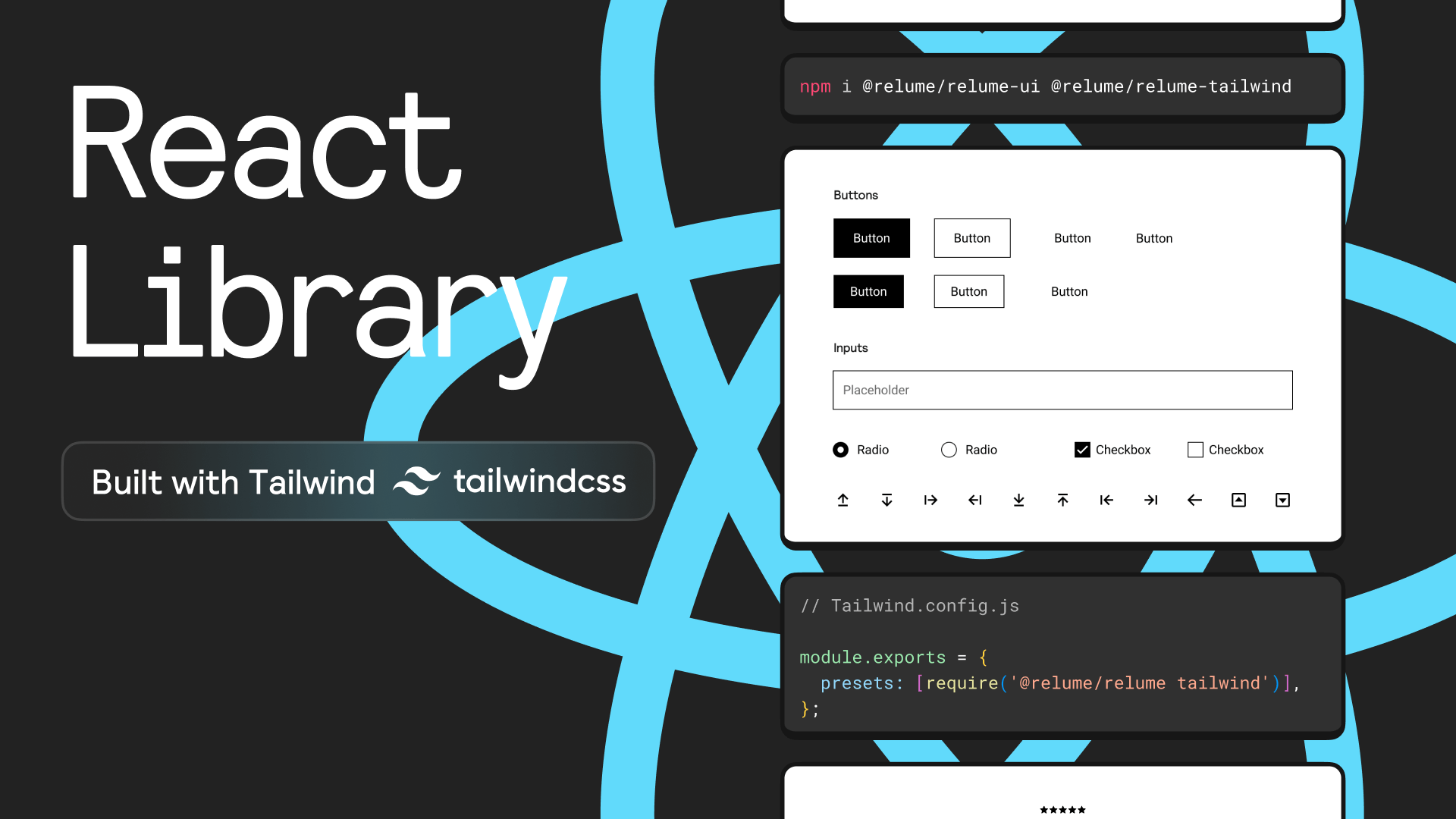
A React + Tailwind component library built for the Relume Library
- 1000+ Section components
- UI elements based on Shadcn UI
- React
- Typescript
- Tailwind CSS
The React components are written in Typescript and are fully typed with props. The full source code for each section can be copy/pasted directly from the Relume Library providing full flexibility and control over the functionality, markup and CSS.
We use component props for variable content like headings, descriptions, images, buttons etc make it easier to connect them to a Headless CMS or feed them a structured data source like JSON.
warning
Exporting of the Relume Style Guide or Relume Designs is not supported with React export. You will only be exporting unstyled wireframes (layouts) from the Relume Site Builder. We have no ETA on when this feature will be released.